This iWatch concept design inspired by FuelBand and iOS7 looks stunning!
The iWatch is really getting a lot of concept designs. And this time, its from Todd Hamilton, a UI designer based in San Fransico. This concept design is Nike+ FuelBand and iOS7 inspired and seems to be much usable!
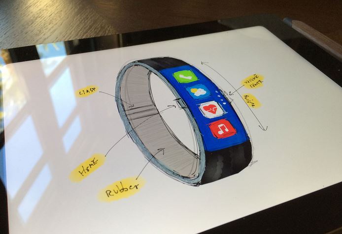
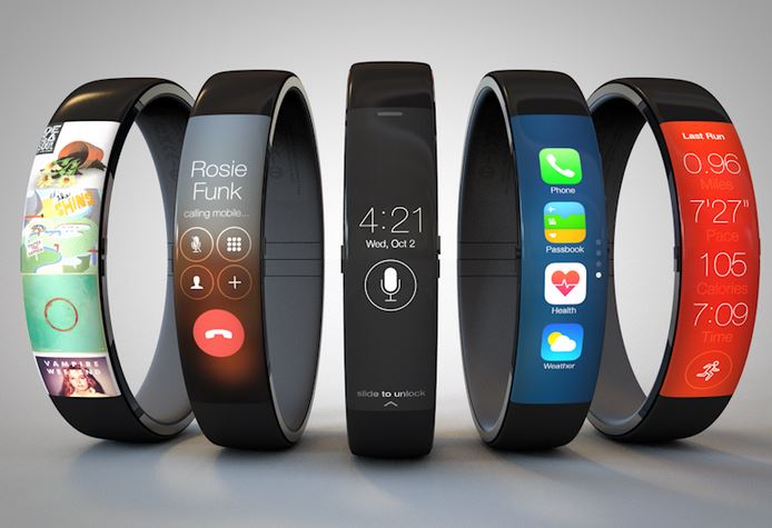
It has a curved touchscreen a single Home button on the left-hand side and buttons for volume control on the right-side. The lockscreen is simple and elegant with time-date display and an option to activate Siri. The designer says, “While I was designing this I found myself pretending what it would be like to use swiping gestures on my wrist. Give it a try, it feels pretty good!”
And yes the pictures and video looks amazingly good! I wish Apple makes an iWatch like this!
For more, see Todd’s post.


