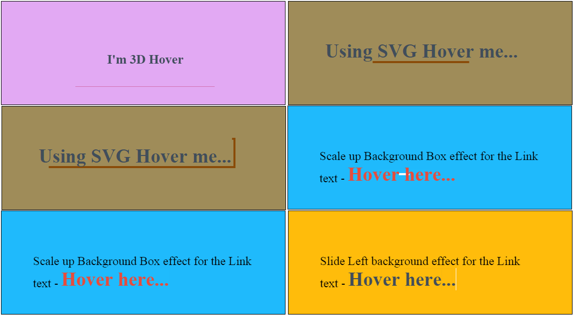
Hope you got some time to read my previous tutorials on 3D Cube rotation and Photo cube gallery. Today I thought of writing few CSS effects for Inline Anchor texts using pseudo-elements, SVG and data attribute. For most part of the demo, we will be using an anchor tag and apply some styles or effects to its pseudo-elements such as ::before and ::after. For the 3D effect, we will be using data attribute and SVG for few effects. The effects varies from FadeIn, Scale Up, Slide Left, Slide Right to 3D rotation. The sad thing is, I’ll not be able to explain all the effects in this tutorial, but yes the demo and the source download will feature all those.
Before we get into the tutorial, please remember that these codes may not work on all browsers. For instance, most of the CSS animation properties are not supported on IE8 and below. Also, few browsers need vendor specific prefixes to be added. If I have missed, you may add it.
As I told earlier, we will be using CSS pseudo elements ::before and ::after. So let me just brief about those.
::before pseudo element
::before pseudo element is used to add some content before the existing content of an element. For example,
#classID::before{
content: '#';
}
::after pseudo element
::after pseudo element is used to add some content after the existing content of an element. For example,
.className::after{
content: '%';
}
Important note here – the pseudo elements MUST have content property. You can choose to have an empty value for the content property, but you cannot just ignore it.
.className::after{
content: ' '; /*empty value for content is allowed*/
}
So, here’s the HTML structure…
 <section class="slideup">
 <p>Slideup background effect for the Link text - <a href="#">Hover here...</a></p>
 </section>
The basic CSS for <section> goes as below,
section {
 position: relative;
 z-index: 1;
 overflow: hidden;
 -webkit-backface-visibility: hidden;
 backface-visibility: hidden;
 float:left;
 width:35%;
 height:80px;
 padding:5%;
 margin:2%;
 border:1px solid #000;
}
section p{font-size:150%;}
section a {
position: relative;
display: inline-block;
outline: none;
color: #404d5b;
vertical-align: bottom;
text-decoration: none;
white-space: nowrap;
font-weight:bold;
overflow:hidden;
font-size:160%;
}
section a::before{
position: absolute;
z-index: -1;
width: 100%;
height: 100%;
}Let’s create some effect – for example, Slide Up effect for the anchor text when hovered.
Slide UP effect on Hover
We need to set up ::before pseudo element.
.slideup a::before {
 content: '';
 -webkit-transition: -webkit-transform 0.5s;
 transition: transform 0.5s;
 -webkit-transform: translateY(98%);
 transform: translateY(98%);
 background-color: #df7401;
}
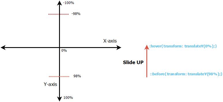
Lookout for the transform property translateY. Since our aim is to create a Slide Up effect (I mean, the action should be performed on Y-axis), we use translateY method. It means, set the transformation to start from 98% at Y-axis ::before hovering. When hovered? Stop the transformation at 0% at Y-axis (translateY(0%))
.slideup a:hover::before,
.slideup a:focus::before {
 -webkit-transform: translateY(0);
 transform: translateY(0);
}
So what does it transform? The background-color set for ::before. Adjust the transition using transition property.
Another example…
Flip effect on Hover
.linkflip{background:#f78181}
.linkflip a {
 -webkit-transition: color 0.3s;
 transition: color 0.3s;
 -webkit-perspective: 600px;
 perspective: 600px;
 -webkit-perspective-origin: 50% 100%;
 perspective-origin: 50% 100%;
}
.linkflip a:hover,
.linkflip a:focus {
color: #e74c3c;
}
.linkflip a::before {
content: '';
background-color: #fff;
-webkit-transition: -webkit-transform 0.5s;
transition: transform 0.5s;
-webkit-transition-timing-function: cubic-bezier(0.7,0,0.3,1);
transition-timing-function: cubic-bezier(0.7,0,0.3,1);
-webkit-transform: rotateX(90deg);
transform: rotateX(90deg);
-webkit-transform-origin: 50% 100%;
transform-origin: 50% 100%;
}.linkflip a:hover::before,
.linkflip a:focus::before {
-webkit-transform: rotateX(0deg);
transform: rotateX(0deg);
}If you have read my previous tutorial on 3D cube rotation, then you must have read about perspective. The perspective property is normally applied for the parent and the child element gets that perspective view. Here, we consider the anchor element as the perspective wrapper, so we apply 3D rotation to ::before pseudo-element. It means, we will perform a rotation of 90 degrees and make it invisible before hovering. When hovered, we bring the rotation back to 0 degrees. What you get? A flip effect.
Checkout the demos for more effects and remember to download the code and play with it.
Note: The demo has not been tested on all browsers. In case if it doesn't work on any specific browser, then you may have to add vendor specific prefix. You are free to download the code and play with it!
Credits: This tutorial would not have been possible without the help from Mary Lou


