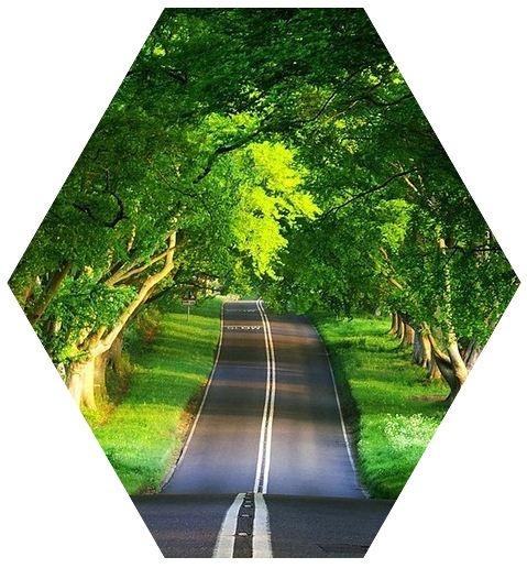
In an attempt to create a hexagon shaped structure with an image inside the hexagon shape, I found many ways of doing it. Thought to share with you all hoping it would help you in some cases. They are :
1. Using border element of css.
2. Using a Hexagonal image template and making an image inscribed in it.
3. Using rotate() method.
and many more ways…..
We shall see each of the above methods one by one.
1. A Hexagon shaped structure with an Image inside using border elements of CSS.
In this, we shall create a shape using border-left and border-right elements as shown in fig-1 below. In our case, we shall replace the red color with the background color, so that the hexagon shape is obtained. And the image would fit at the center white hexagonal shape.
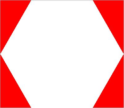
Based on the width and height of the image, you need to adjust the border-left and border-right of the hexagon span tag and also the border-bottom and border-top of top and bottom span tags.
Use the below stylesheet in the head tag of your HTML page.
<style>
.hexagon span {
    position: absolute;
    display: block;
    border-left: 100px solid #fff;
    border-right: 100px solid #fff;
    width: 200px;
    float:left;
}
.top {
    top: 0;
    border-bottom: 173px solid transparent;
}
.bottom{
    bottom: 0;
    border-top: 173px solid transparent;
}
.hexagon {
    background: url("model.JPG");
    width: 400px;
    height: 295px;
    position: relative;
    display: inline-block;
}
</style>
Use the below in the body tag of your HTML page :
<div class="hexagon pic">
<span class="top"></span>
<span class="bottom"></span>
</div>
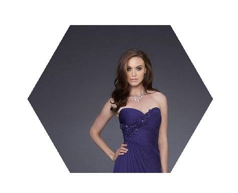
With the above code, we would get the hexagonal shape with an image inside the hexagon shape is as shown below :
The other way of representing the hexagonal shape with same method is as shown below in fig 3.
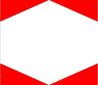
Use the below stylesheet in your head tag:
<style>
.hexagon1 span {
    position: absolute;
    display: block;
    float:left;
border-left: 170px solid #fff;
border-right: 170px solid #fff;
}

.top1 {
top: 0;
border-top: 0px solid transparent;
 border-bottom: 75px solid transparent;
}

.bottom1{
bottom: 0px;
border-bottom: 0px solid transparent;
border-top: 75px solid transparent;
}

.hexagon1 {
    background: url("model.JPG");
    width: 340px;
    height: 295px;
    position: relative;
    display: inline-block;
}
</style>
Use the below in the body tag of your HTML page :
<div class="hexagon1 pic">
<span class="top1"></span>
<span class="bottom1"></span>
</div>
With the above code, we would get the hexagonal shape with an image inside the hexagon shape is as shown below :
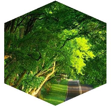
2. Using a ready Hexagonal shaped image template and making an image inscribed in it.
This would be much simpler with no hiccups of the code. Firstly we shall create a Hexagon shaped image template as shown below and will put our image inside it with the below code.

Insert the below code in stylesheet of your HTML page.
<style>
.hex-template {
background:url("nature_world.jpg") no-repeat;
width: 491px;
height: 385px;
float:left;
}
.hex-template2 {
background:url("nature_world.jpg") no-repeat;
width: 392px;
height: 451px;
float:left;
}
</style>
Insert the below code in the body tag of your HTML page.
<div class="hex-template"><img src="hexagon.png" /></div>
<div class="hex-template2"><img src="hexagon1.png" /></div>
With the above code, we would get the image inside the hexagonal shaped structure as shown below :
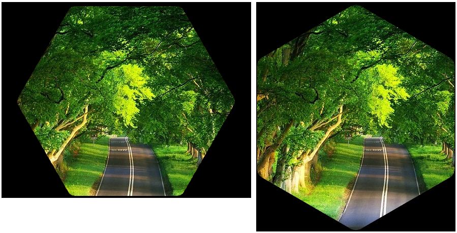
3. Using rotate() method of CSS3 transform to create a hexagonal shaped structure with an image inside it
The CSS transform property allows you to visually manipulate element, literally transforming their appearance. There are several different transform functions each that applies a different visual effect. Rotate() is one such which rotates clockwise from current position. So we shall create an initial box with shadow of white as shown below:
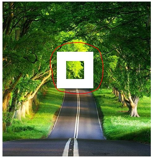
.hex:after {
content: '';
position: absolute;
top: 40%;
left: 43%;
width: 12%;
padding-top: 12%;
transform: rotatex(0deg) rotate(0deg);
text-align: center;
box-shadow: 0 0 0 30px white;
}
With the rotate() transform property, we shall rotate with 45 degrees to make it rhombus and with rotatex() we shall rotate the box on it x-axis as shown below :

transform: rotatex(53deg) rotate(45deg);
Then adjust the width, padding-top to get the structure as shown below:

.hex:after {
content: '';
position: absolute;
/* top: 40%; */
left: -10%;
width: 120%;
padding-top: 120%;
transform: rotatex(53deg) rotate(45deg);
text-align: center;
box-shadow: 0 0 0 40px white;
}
Adjust the box-shadow to hide out the excess of the hexagon structure with the background color ie., in the example white.
box-shadow: 0 0 0 175px white;
To get the final hexagonal structure with image inside as shown below.
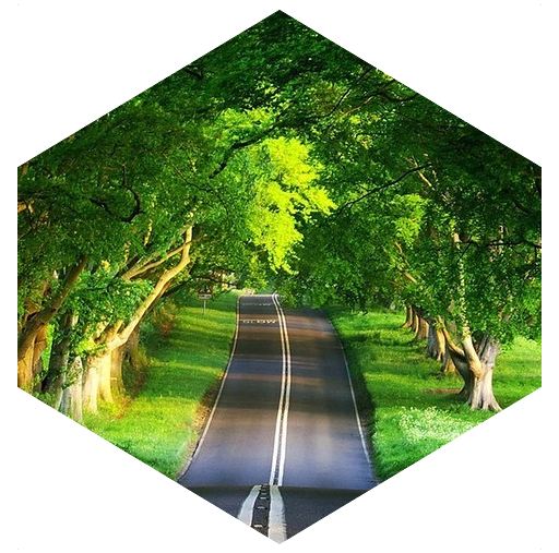
Below is the complete code:
<style>
.hex  {
  position:relative;
  margin:auto;
  text-align:center;
  overflow:hidden;
  white-space:nowrap;
  display:table;
  float:left;
  margin-right:20px;
}
.hex:before {
  content:'';
  padding-top:120%;
  display:inline-block;
  vertical-align:middle;
}
.hex:after {
  content:'';
  position:absolute;
  top:0%;
  left:-10%;
  width:120%;
  padding-top:120%;
  transform: rotatex(52deg) rotate(45deg);
  text-align:center;
  box-shadow:0 0 0 200px white;;
}
.hex img {
  display:inline-block;
  vertical-align:middle;
  margin:0 -10px;
}
</style>

<div class="hex"><img src="nature_world.jpg" /></div>
You can also adjust the transform with below to get the other hexagonal structure as shown below:
transform: rotatey(55deg) rotate(-45deg);
