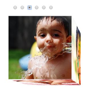
Before we get into the implementation part of 3D Photo Cube Image Gallery, make sure you have read my previous tutorial on : How to create an animating 3D cube using pure CSS. When I shared the post on Google+, one of my friend commented as “But of what earthly use is it?”. I did replied saying that, the tutorial was just a base on which you can create 3D photo cube or 3D Image gallery or even a creative 3D progress bar and that’s what this tutorial is all about. If you have read my previous tutorial, you would have learnt to create 3D cube and then a 3D Photo cube as well. This tutorial is just an extension of 3D Photo cube – where we will add an interactive transformation to the photo cube using a simple CSS Checkbox hack.
Step 1: Make sure you download the source code of 3D Photo Cube.
Once you unzip and open index.html in the browser, you should see a rotating 3D cube. Our idea is to add some interactivity to it -with six radio buttons and when checked, the cube turns to the respective side – we are going this behavior as “3D Photo Cube Image Gallery”. Shall we?
Step 2: Lets stop the cube from rotating. To do that, open style.css and remove “@keyframes rotate” rule. This rule is responsible for rotating the photo cube by 360 deg.
Now you will see only the front side of the cube and all other sides are hidden. Lets add checkbox now and rotate the cube when checked.
Step 3: Open index.html and add six checkboxes as below
<link rel="stylesheet" type="text/css" href="style.css">
<input type="radio" checked id="rFront" name="select-face"/>
<input type="radio" id="rLeft" name="select-face"/>
<input type="radio" id="rRight" name="select-face"/>
<input type="radio" id="rTop" name="select-face"/>
<input type="radio" id="rBottom" name="select-face"/>
<input type="radio" id="rBack" name="select-face"/>
Step 4: When each checkbox is selected, the respective sides are brought to the front for display. To do that we will use CSS Checkbox hack by CSS-tricks.com. Add the below code in style.css.
#rBack:checked ~ .wrap .cube {
 transform: rotateY(180deg);
}
#rLeft:checked ~ .wrap .cube {
 transform: rotateY(90deg);
}
#rRight:checked ~ .wrap .cube {
 transform: rotateY(-90deg);
}
#rTop:checked ~ .wrap .cube {
 transform: rotateX(-90deg);
}
#rBottom:checked ~ .wrap .cube {
 transform: rotateX(90deg);
}
Step 5: Add transition effect between the side rotation. Lookout for ‘.cube‘ class in style.css and add the below lines.
 transition: transform 0.6s;
 -webkit-transition: transform 0.6s;
 -ms-transition: transform 0.6s;
Change the Perspective to make the gallery to look like a cube
Step 6: Change the perspective origin a bit to transform the gallery to look like a cube. Lookout for the ‘.wrap‘ class in style.css and change the values of ‘perspective-origin:‘
perspective-origin: 150% 150%;
That’s it. Click on the checkbox to see the photos being rotated.
Note: The demo has not been tested on all browsers, in case if it fails to work on a specific browser then you may have to add the vendor specific -prefix to certain css properties like transform, @keyframes, perspective etc...
Download the full source code here.


