
CSS3 transitions are a great boon to the web-designers. In a way we can add awesome effects with just few lines of css code than using heavy Flash animation or JQuery, since all modern browsers support css3 transitions. CSS3 and HTML5 are developing faster and faster, making all browsers to support new features of CSS3 and Html5.
These days many sites show images to attract visitors and want the visitors share it on social platforms. In this tutorial we shall see how best we can present the social buttons using CSS3 transitions on hover an image.
Before proceeding to the coding, have a look at the demo and come back to discuss how to achieve it.
[sc:demobuttons demolink=”http://demo.techglimpse.com/css3-transitions-like-button-onhover/” boxlink=”https://app.box.com/s/zxh9344ng7iqj65xxmm0″]
For understanding, we shall break the transitions into 2 parts.
1. Opacity Transition
2. Offset Transition
From the demo, you would notice that with the sequence of above steps, it looks like the social button flies from an offset place to center and similarly on the vice-versa, it diminishes towards the offset place. For simplification, I have used a counter to show the no. of likes. But you can either social buttons from Facebook, Twitter, Pinterest, Google+ etc., or even on click, pop-up further information. The below code doesn’t include the counter.
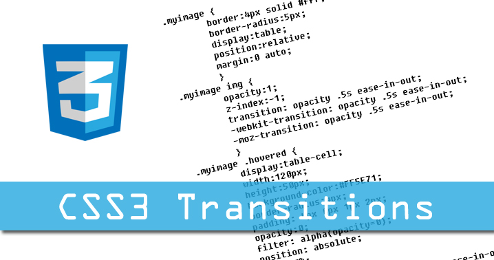
Step1 : Add the below css code in your head section.
.myimage {
border:4px solid #fff;
border-radius:5px;
display:table;
position:relative;
margin:0 auto;
}
.myimage img {
opacity:1;
z-index:-1;
}
.myimage .hovered {
display:table-cell;
width:120px;
height:50px;
background-color:#FF5E71;
border-radius:4px;
padding: 4px 0px 1px 2px;
opacity:0;
filter: alpha(opacity=0);
position: absolute;
top: 65%;
z-index: 9999;
left: 45%;
transition: top .5s, opacity .3s ease-in-out;
-webkit-transition: top .5s, opacity .3s ease-in-out;
-moz-transition: top .5s, opacity .3s ease-in-out;
}
.myimage:hover .post-image {
filter: alpha(opacity=60);
opacity:0.6;
}
.myimage:hover .hovered {
top: 45%;
opacity:1;
filter: alpha(opacity=100);
cursor:pointer;
}
.like-btn {
float:left;
width:40px;
padding:5px;
padding-left: 10px;
}
.thick-line {
height: 28px;
position: relative;
display: table-cell;
top: 10px;
left: 7px;
border-left: 1px solid #fff;
float:left;
}
.numbers {
position: absolute;
display: block;
left: 80px;
top: 10px;
color: #fff;
line-height: 35px;
font-weight: bold;
font-size: 22px;
}
Step 2: Add the below html code in your body section.
<div class="myimage">
<div class="hovered">
<img id="number1" class="like-btn" src="Like-button.png" alt="Like" />
<div class="thick-line"></div>
<div id="num1" class="numbers">1</div>
</div>
<img class="post-image" src="1.jpg" width="800px" />
</div>
[sc:demobuttons demolink=”http://demo.techglimpse.com/css3-transitions-like-button-onhover/” boxlink=”https://app.box.com/s/zxh9344ng7iqj65xxmm0″]
The Above code shows only the first transition effect from the demo. For different transition effects, you need to modify the transitions accordingly.
Conclusion:
It is the right time for the web designers and web masters to take necessary actions in migrating the transitions and animations created using Jquery/Javascript to CSS3 at all possible places and reduce the loading time of web pages.