I was recently working on a portfolio design for a client. The requirement was quite challenging that I have never designed before. The client wants me to create an animation when a mouse hovered over an image. For example, when the visitor hovers mouse over the image, the forklift has to move forward and lift an object placed on the floor. Well, the concept made sense because, the client provides forklift rental services. So how did I do that? In this tutorial I’ll share my experience in Using CSS3 Animations for a Creative Portfolio design.
According to the concept, I need to have three images overlapped each other. For example, I need a forklift, the lever that lifts the object and the object it self. Well, the challenge started right from here – how do I place three transparent images overlapped each other? It’s quite easy. Click here to learn how to overlap three images. But wait, why should I overlap those images? Because, I need to place them as close as possible, so that the forklift lever can attach to the forklift and the forklift can move forward to lift the object.
Below GIF shows completed design with animation effect on hover.
Experience:
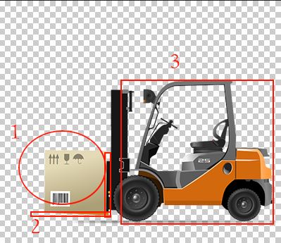
I started with a fixed background image of 400px X 344px. Next, I need to create three images (forklift, the lever and object) with the same size and transparent background as shown in the image below and overlapped each other. This break up of images helps in creating animating each individually (as you see in the above GIF).
Challenge 1: How to make the 3 images overlap on top of each other.
By using position attribute in CSS styles. Make the position as absolute for the images 1 & 2 and then relative for the 3rd image.
At the initial position, let the 1st image be at the same location, whereas the 2nd & 3rd be shifted towards the right as shown in the image below. Set overflow: hidden for the 3rd image, so that it doesn’t show outside the boundary.
The HTML code for the above is as follows:
<div class="portfolio-box">
   <div id="pb" class="portfolio-animation">
      <img id="image1" src="weight.png" />
      <img id="image2" src="forklift-lever.png" />
      <img id="image3" src="forklift.png" />
   </div>
</div>
and the CSS code as follows:
.portfolio-box {
 height:344px;
 width:400px;
 overflow: hidden;
 cursor: pointer;
}
.portfolio-animation {
 height:100%;
 width:100%;
 overflow: hidden;
 background-image: url("bg.png");
 background-repeat: no-repeat;
 background-size: cover;
 position: relative; /* Important */
}
.portfolio-animation img:nth-child(1) {
 left:0;
 position: absolute;
 overflow: hidden;
}
.portfolio-animation img:nth-child(2) {
 left:107px;
 position: absolute;
 overflow: hidden;
}
.portfolio-animation img:nth-child(3) {
 left:107px;
 position: relative;
 overflow: hidden;
}
Now the design and elements are ready, we need to create animation on hover. Initially I tried with CSS3 transform. Everything was perfect except for the 2nd image as shown below.
Challenge 2: The 2nd image supposed to have the horizontal movement first and then vertical movement. The vertical movement should have a delay of 1s by which the horizontal movement would be completed.
Below is the complete CSS code which includes above transitions:
.portfolio-box {
 height:344px;
 width:400px;
 overflow: hidden;
 cursor: pointer;
}
.portfolio-animation {
 height:100%;
 width:100%;
 overflow: hidden;
 background-image: url("bg.png");
 background-repeat: no-repeat;
 background-size: cover;
}
 .portfolio-box:hover > .portfolio-animation #forklift-lever {
 transition-delay: 0.8s;
 -webkit-transition-delay:0.8s;
 transform:translateX(-107px) translateY(-107px) ;
 -webkit-transform: translateX(-107px) translateY(-107px);
}
.portfolio-box:hover > .portfolio-animation #forklift {
 transform: translate(-107px, 0px);
 -webkit-transform: translate(-107px,0px);
}
.portfolio-box:hover > .portfolio-animation #forklift-weight {
 transition-delay: 1.5s;
 -webkit-transition-delay: 1.5s;
 transform: translate(0px,-107px) ;
 -webkit-transform: translate(0px,-107px);
}
.portfolio-animation img:nth-child(1) {
 left:0;
 position: absolute;
 overflow: hidden;
 -webkit-transition: all .75s ease-in-out .1s;
}
.portfolio-animation img:nth-child(2) {
 left:107px;
 position: absolute;
 -webkit-transition: all 0.75s ease-in-out 0.75s;
}
.portfolio-animation img:nth-child(3) {
 left:100px;
 position: relative;
 overflow: hidden;
 -webkit-transition: all .75s ease-in-out .75s;
}
Even after struggling for 2 days, I couldn’t find a solution. After much googling, I understand that the delay can’t be introduced between the transformations as shown with red text in the above CSS code, but the same can be explored using CSS3 animation as shown in the below css code:
 .portfolio-box {
   height:344px;
   width:400px;
   overflow: hidden;
   cursor: pointer;
 }
 .portfolio-animation {
   height:100%;
   width:100%;
   overflow: hidden;
   background-image: url("bg.png");
   background-repeat: no-repeat;
   background-size: cover;
   position: relative;
 }
 .portfolio-animation img:nth-child(1) {
   left:0;
   position: absolute;
   overflow: hidden;
 }
 .portfolio-animation img:nth-child(2) {
   left:107px;
   position: absolute;
   overflow: hidden;
 }
 .portfolio-animation img:nth-child(3) {
   left:107px;
   position: relative;
   overflow: hidden;
 }
 .portfolio-animation:hover img:nth-child(3) {
   -webkit-animation: animation1 1s ease-in-out 0s forwards;
 }
 .portfolio-animation:hover img:nth-child(2) {
   -webkit-animation: animation2 2s ease-in-out 0s forwards;
 }
 .portfolio-animation:hover img:nth-child(1) {
   -webkit-animation: animation3 1s ease-in-out 1s forwards;
 }
 @keyframes animation1 {
   from {
     transform: translate(0px, 0px);
   }
   to {
     transform: translate(-107px, 0px);
   }
 }
 @keyframes animation2 {
   from {
     transform: translate(0px, 0px);
   }
   50% {
     transform: translate(-107px, 0px);
   }
   to {
     transform: translate(-107px, -100px);
   }
 }
 @keyframes animation3 {
   from {
     transform: translate(0px, 0px);
   }
   to {
     transform: translate(0px, -100px);
   }
 }
Challenge 3: On hover, I could able to achieve what I suppose to, but on hover out/mouse out, the reverse animation wasn’t happening. If you are using CSS3 animation property, then you need to explicitly create the reverse animation too, which I hadn’t created! Then after googling, I found that, you can’t create a mouseout event in CSS just like jQuery or Javascript. So I applied the mouse out animation to the images, but then these animations were happening on page load itself, which is not what I wanted. Here’s a quick solution to the problem.
Using Javascript/jQuery, remove the class name "out" and add a class name "over" to the <div id="pb" class="portfolio-animation"> on hover and on mouse out, remove the class "over" and add "out" as shown below:
<script src="jquery-3.3.1.js"></script>
<script>
   $('#pb').hover(function () {
     $(this).removeClass('out').addClass('over');
   }, function() {
     $(this).removeClass('over').addClass('out');
   });
</script>
And then apply the animations for the class "out" which is a mouse out event.
.portfolio-animation.out img:nth-child(1) {
 -webkit-animation: animation3out 1s ease-in-out 0s backwards;
}
.portfolio-animation.out img:nth-child(2) {
 -webkit-animation: animation2out 2s ease-in-out 0s backwards;
}
.portfolio-animation.out img:nth-child(3) {
 -webkit-animation: animation1out 1s ease-in-out 1s backwards;
 }

@keyframes animation3out {
 from {
 transform: translate(0px, -100px);
 }
 to {
 transform: translate(0px, 0px);
 }
}
@keyframes animation2out {
 from {
 transform: translate(-107px, -100px);
 }
 50% {
 transform: translate(-107px, 0px);
 }
 to {
 transform: translate(0px, 0px);
 }
}
@keyframes animation1out {
 from {
 transform: translate(-107px, 0px);
 }
 to {
 transform: translate(0px, 0px);
 }
}
Note: For responsive on mobile and tablet devices, you can display a static image of the same dimension, as the CSS3 animations on hover effect will not make any sense on those devices.
That’s it. Hope my experience would help out somebody.


