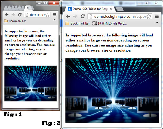
These days it is more important you design your website in a responsive way. Smartphone revolution is being happenings and every one uses smartphones even for browsing. This makes the web designer to create websites according to the devices. To lessen the burden of programming for different devices, one creation should work for any devices. This is called as responsive design. Here i will be showing you one such responsive way of showing images. As you change the resolution, accordingly the image width and height changes. Below snapshot shows the image for different browser sizes – you can notice the image being re-sized accordingly to fit the browser’s size.
Step 1 : include the below CSS in the Head section of your HTML Template.
<style type=”text/css”>
/* responsive image */
img {
max-width: 100%;
height: auto;
}
@media \0screen {
img {
width: auto; /* for ie 8 */
}
}
figure {
margin: 0;
}
/* html5 elements */
figure {
display: block;
}
</style>
Max-width property allows you to set the max width and Height of the image respectively. You can make the image auto resize to the max width of the boundary by using max-width:100% and height:auto. The above CSS works for all browsers.
Step 2 : Include the below content in the Body section of your HTML Template
<h4>In supported browsers, the following image will load either small or large version depending on screen resolution. You can see image size adjusting as you change your browser size or resolution</h4>
<figure>
<img src=”http://demo.techglimpse.com/responsiveimg/responsive-technology.jpg” alt=”Responsive Technology for Auto Image Resize using CSS and HTML 5″>
</figure>
Here the figure is a HTML5 Element. Enjoy the responsive auto resize of image using simple pure CSS and HTML5 tricks.


