Everyone might have heard about CSS animations, transitions, transformations, perspective etc…I thought of creating a simple tutorial based on those known CSS techniques. The idea is to create a rotating 3D cube using pure CSS properties. However, one might ask me what are the advantages of using CSS animations over JavaScript. Of course there are few to point out – mainly, CSS animations are simple and easy to create. Secondly, the animations doesn’t consume much of your computing resource and importantly, the animation sequences are left to the browser – thus allowing the browser to optimize the performance and efficiency.
Main Components of CSS Animation
CSS Animations are based on two main components – a style that describes the animation (using animation property) and a keyframe (using @keyframes at-rule) that defines the start and stop of the animation’s style. Of course, the keyframe is responsible for intermediate transitions, transformations during its journey from start till the end.
Well, we are supposed to speak about an Animation of 3D cube isn’t? Lets try doing it now.

Create the sides of the Cube
The first step is to create the sides of the cube – of course, the six sides are front, back, top, bottom, left and right. This step is not a rocket science isn’t? You know that we are going to use the favorite block element <div> for each side and then wrap all of them to call it as cube (of course cube is the parent div of all the side divs). Finally, the entire cube markup is wrapped by the main div (parent of all). So, the structure goes as the below picture.
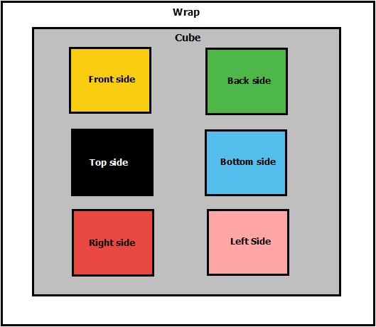
The HTML markup should look like this…
<div class="wrap">
 <div class="cube">
 <div class="front">
 Front side
 </div>
 <div class="back">
 Back side
 </div>
 <div class="top">
 Top side
 </div>
 <div class="bottom">
 Bottom side
 </div>
 <div class="left">
 Left side
 </div>
 <div class="right">
 Right side
 </div>
 </div><!--The cube-->
</div><--The Wrap -->
Set Perspective for the cube
CSS Perspective property defines the placement (in pixels) of an 3D element from the view. Did I confuse? Perspective property helps you change the perspective of how the cube is viewed. Generally, perspective property is defined for the PARENT element, in order to give perspective to the CHILD elements. For example, in our case the <div class=”wrap”> is the PARENT and <div class=”cube”> is the 3D CHILD element. So the perspective should be defined for class “wrap” and the one that gets the view is “cube“. Hope I didn’t confuse now?
Here’s how the perspective is defined…
.wrap{
 margin-top: 200px;
 perspective: 1000px;
 perspective-origin: 50% 50%;
}
Setup the sides of the Cube
Firstly, all the six sides of the cube should be positioned:absolute and the <div class=”cube”> should be positioned:relative.
.cube {
 margin: auto;
 position: relative;
 height: 200px;
 width: 200px;
 transform-style: preserve-3d;
 -ms-transform-style: preserve-3d;
 -webkit-transform-style: preserve-3d;
}
.cube div {
 position: absolute;
 box-sizing: border-box;
 padding: 10px;
 height: 100%;
 width: 100%;
 opacity: 0.9;
 border: solid 1px #eeeeee;
 color: #ffffff;
}
Lookout for the ‘transform-style: preserve-3d‘ property, which allows the transformed Child elements to preserve 3D transformation. Well, the child of ‘cube‘ is ‘front, back, right, left, top, bottom’.
Now, when you preview the page in browser – you see nothing. So, lets set color to the sides.
.front {
background-color:#f8cc0f;
}
.back {
background-color:#4db849;
}
.right {
background-color:#e8483f;
}
.left {
background-color:#ffa6a6;
}
.top {
background-color:#000;
}
.bottom {
background-color:#53bdeb;
}
Apply transformations to the sides
Now, in the above classes for sides we shall apply the transformation to rotate and transform it to a cube. The code goes as below,
.front {
 transform: translateZ(100px);
 -ms-transform: translateZ(100px);
 -webkit-transform: translateZ(100px);
 background-color:#f8cc0f;
}
.back {
 transform: translateZ(-100px) rotateY(180deg);
 -webkit-transform: translateZ(-100px) rotateY(180deg);
 -ms-transform: translateZ(-100px) rotateY(180deg);
 background-color:#4db849;
}
.right {
 transform: rotateY(-270deg) translateX(100px);
 -ms-transform: rotateY(-270deg) translateX(100px);
 -webkit-transform: rotateY(-270deg) translateX(100px);
 transform-origin: top right;
 -ms-transform-origin: top right;
 -webkit-transform-origin: top right;
 background-color:#e8483f;
}
.left {
 transform: rotateY(270deg) translateX(-100px);
 -webkit-transform: rotateY(270deg) translateX(-100px);
 -ms-transform: rotateY(270deg) translateX(-100px);
 transform-origin: center left;
 -ms-transform-origin: center left;
 -webkit-transform-origin: center left;
 background-color:#ffa6a6;
}
.top {
 transform: rotateX(-270deg) translateY(-100px);
 -webkit-transform: rotateX(-270deg) translateY(-100px);
 -ms-transform: rotateX(-270deg) translateY(-100px);
 transform-origin: top center;
 -ms-transform-origin: top center;
 -webkit-transform-origin: top center;
 background-color:#000;
}
.bottom {
 transform: rotateX(270deg) translateY(100px);
 -webkit-transform: rotateX(270deg) translateY(100px);
 -ms-transform: rotateX(270deg) translateY(100px);
 transform-origin: bottom center;
 -ms-transform-origin: bottom center;
 -webkit-transform-origin: bottom center;
 background-color:#53bdeb;
}
The transform property allows you to rotate, scale, move, skew 2D or 3D elements. Now we have transformed the simple div’s (sides) to resemble a cube.

Animate the Cube
We have the cube ready, but lets animate it to view the cube properly. Moreover, that’s the goal of this tutorial as well. So lets do it.
If you go to the second para of this article, you will understand that there are two main components that allows you to create an animation – style the animation and use @keyframes rule to define the start and end point. In our example, the cube is not going to do any zig-zag dancing, but stays at one point and rotates to 360 degrees. It means, the from position at the @keyframes will have the transform property set to 0deg for both X axis and Y axis and the to position @keyframes will have the transform property set to 360deg for both the X axis and Y axis.
@keyframes rotate {
 from {
 transform: rotateX(0deg) rotateY(0deg);
 -ms-transform: rotateX(0deg) rotateY(0deg);
 -webkit-transform: rotateX(0deg) rotateY(0deg);
 }
to {
 transform: rotateX(360deg) rotateY(360deg);
 -ms-transform: rotateX(360deg) rotateY(360deg);
 -webkit-transform: rotateX(360deg) rotateY(360deg);
 }
}
@-webkit-keyframes rotate {
 from {
 transform: rotateX(0deg) rotateY(0deg);
 -ms-transform: rotateX(0deg) rotateY(0deg);
 -webkit-transform: rotateX(0deg) rotateY(0deg);
 }
to {
 transform: rotateX(360deg) rotateY(360deg);
 -ms-transform: rotateX(360deg) rotateY(360deg);
 -webkit-transform: rotateX(360deg) rotateY(360deg);
 }
}
.cube {
 animation: rotate 20s infinite linear;
 -webkit-animation: rotate 20s infinite linear;
}
You should see a rotating cube as shown at the top of this page.

Note: The demo has not been tested on all browsers, in case if it fails to work on a specific browser then you may have to add the vendor specific -prefix to certain css properties like transform, @keyframes, perspective etc...
Download the source code here.
I should definitely give a credit to codicode.com for teching me CSS animation, else I’ll be called selfish.
Update:
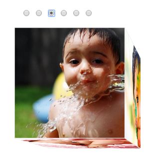
One of my friend in Google+ commented me this : “But of what earthly use is it?”. Well, the 3D cube demo is useful for creating an 3D Photo cube. Here’s the sample.
Create 3D Photo Cube using Pure CSS
To do that, just add background image to the classes : front, back, top, bottom, left, right. You may have to adjust the background-size accordingly, if the image doesn’t fit within the square.
 background: url('2.JPG');
 background-size:120%;
The 3D Photo Cube is ready now.
 Download the source code of 3D Photo Cube.
Create 3D Photo Cube Gallery
Click on the below image to see the demo of 3D Photo cube gallery and its source code.