
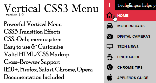
If you are developing a website and searching for an attractive, simple and effective menu then you have come to the right place! In this tutorial, you would be provided CSS based vertical menu with smooth transitions using CSS3 only. The menu is cross-browser compatible and 100% CSS. You will also be provided with the downloadable code and instructions in one zip file package. Lets start the tutorial. And yes, there is no JavaScript work involved!
Before starting the tutorial, lets collect all the required icons. The icons used in the demo is from Austin Andrews (@templarian). You can find it here. I have created an sprite image with the set of required icons, so that the loading time is reduced.
[sc:demobuttons demolink=”http://demo.techglimpse.com/css-vertical-menu/” boxlink=”https://app.box.com/s/l9el3iqsrgzx702z2zdp”]
The CSS3 transition flow is as below:
1. On hover of vertical bar of menu icons, extend the width to 200px.
2. Have the menu title hidden and on hover while extending the width, make it visible too.
Make all the above transitions smooth using CSS3 transitions. You just have to play in the below CSS code for your specific requirements.
Step 1 : Add the below CSS code in your head section
<style>
body {
margin:0;
}
/* Header Start */
.fixedlogo { background-color: #e02e42; width: 40px; left: 0; text-align: center; line-height: 40px; font-size: 25px; color: #fff; font-family: serif; position:fixed; cursor:pointer; }
.fixedlogo:hover { background-color:#f75f70; }
.fixedheader { background-color: #000000; width: 100%; left: 40px; text-align: center; line-height: 40px; font-size: 25px; color: #fff; font-family: serif; position: fixed; }
/* Header Over */
.menulist { background-color: #555555; width: 40px; height:100%; left: 0; position:fixed; top:40px; transition: width .3s; -webkit-transition: width .3s; }
.menulist:hover { width:200px; }
.first, .second, .third, .fourth, .fifth, .sixth, .seventh, .eighth, .nineth, .tenth, .eleventh, .twelveth, .thirteenth, .fourteenth, .fifteenth, .sixteenth, .seventeenth { background-color:#cccccc; line-height: 40px; height:40px; cursor:pointer; -webkit-font-smoothing: antialiased; font-smoothing: antialiased; transition: all .2s; -webkit-transition: all .2s; }
.first:hover, .second:hover, .third:hover, .fourth:hover, .fifth:hover, .sixth:hover, .seventh:hover, .eighth:hover, .nineth:hover, .tenth:hover, .eleventh:hover, .twelveth:hover, .thirteenth:hover, .fourteenth:hover, .fifteenth:hover, .sixteenth:hover, .seventeenth:hover { background-color:#e02e42; }
.first:hover .firsticon, .second:hover .secondicon, .third:hover .thirdicon, .fourth:hover .fourthicon, .fifth:hover .fifthicon, .sixth:hover .sixthicon, .seventh:hover .seventhicon, .eighth:hover .eighthicon, .nineth:hover .ninethicon, .tenth:hover .tenthicon, .eleventh:hover .eleventhicon, .twelveth:hover .twelvethicon, .thirteenth:hover .thirteenthicon, .fourteenth:hover .fourteenthicon, .fifteenth:hover .fifteenthicon, .sixteenth:hover .sixteenthicon, .seventeenth:hover .seventeenthicon { color:#fff; }
.firsticon, .secondicon, .thirdicon, .fourthicon, .fifthicon, .sixthicon, .seventhicon, .eighthicon, .ninethicon, .tenthicon, .eleventhicon, .twelvethicon, .thirteenthicon, .fourteenthicon, .fifteenthicon, .sixteenthicon, .seventeenthicon { background: url("icons.png") no-repeat; width: 40px; float:left; text-decoration:none; color:#000; transition: all .1s ease-in; -webkit-transition: all .1s ease-in; }
.firsticontext, .secondicontext, .thirdicontext, .fourthicontext, .fifthicontext, .sixthicontext, .seventhicontext, .eighthicontext, .ninethicontext, .tenthicontext, .eleventhicontext, .twelvethicontext, .thirteenthicontext, .fourteenthicontext, .fifteenthicontext, .sixteenthicontext, .seventeenthicontext { opacity:0; font-size: 14px; text-indent: 50px; font-weight: bold; width:200px; text-transform: uppercase; transition:opacity .0s ease-in; -webkit-transition:opacity .0s ease-in;-webkit-transition-delay: .1s;transition-delay: .1s; }
.menulist:hover .firsticontext, .menulist:hover .secondicontext, .menulist:hover .thirdicontext, .menulist:hover .fourthicontext, .menulist:hover .fifthicontext, .menulist:hover .sixthicontext, .menulist:hover .seventhicontext, .menulist:hover .eighthicontext, .menulist:hover .ninethicontext, .menulist:hover .tenthicontext, .menulist:hover .eleventhicontext, .menulist:hover .twelvethicontext, .menulist:hover .thirteenthicontext, .menulist:hover .fourteenthicontext, .menulist:hover .fifteenthicontext, .menulist:hover .sixteenthicontext, .menulist:hover .seventeenthicontext { opacity:1; }
.firsticon { background-position: -3px 4px; }
.secondicon { background-position: -38px 4px; }
.thirdicon { background-position: -78px 4px; }
.fourthicon { background-position: -114px 4px; }
.fifthicon { background-position: -149px 4px; }
.sixthicon { background-position: -183px 4px; }
.seventhicon { background-position: -216px 4px; }
.eighthicon { background-position: -248px 4px; }
.ninethicon { background-position: -288px 4px; }
.tenthicon { background-position: -326px 4px; }
.eleventhicon { background-position: -360px 4px; }
.twelvethicon { background-position: -394px 4px; }
.thirteenthicon { background-position: -429px 4px; }
.fourteenthicon { background-position: -465px 4px; }
.fifteenthicon { background-position: -502px 4px; }
.sixteenthicon { background-position: -535px 4px; }
.seventeenthicon { background-position: -568px 4px; }
</style>
Step 2: Add the below HTML code in your body section
<div class="fixedlogo">T</div><div class="fixedheader">Techglimpse.com</div>
<div class="menulist">
<nav>
<div class="first"><a href="" class="firsticon"><div class="firsticontext">Home</div></a></div>
<div class="second"><a href="" class="secondicon"><div class="secondicontext">Modern Cars</div></a></div>
<div class="third"><a href="" class="thirdicon"><div class="thirdicontext">Digital Cameras</div></a></div>
<div class="fourth"><a href="" class="fourthicon"><div class="fourthicontext">Tech News</div></a></div>
<div class="fifth"><a href="" class="fifthicon"><div class="fifthicontext">Linux Guide</div></a></div>
<div class="sixth"><a href="" class="sixthicon"><div class="sixthicontext">Chrome Tips</div></a></div>
<div class="seventh"><a href="" class="seventhicon"><div class="seventhicontext">Apple/iOS Guide</div></a></div>
<div class="eighth"><a href="" class="eighthicon"><div class="eighthicontext">Android Apps</div></a></div>
<div class="nineth"><a href="" class="ninethicon"><div class="ninethicontext">Windows8 Guide</div></a></div>
<div class="tenth"><a href="" class="tenthicon"><div class="tenthicontext">Wordpress Tips</div></a></div>
<div class="eleventh"><a href="" class="eleventhicon"><div class="eleventhicontext">Smartphone's</div></a></div>
<div class="twelveth"><a href="" class="twelvethicon"><div class="twelvethicontext">Security Tips</div></a></div>
<div class="thirteenth"><a href="" class="thirteenthicon"><div class="thirteenthicontext">Web Designs</div></a></div>
<div class="fourteenth"><a href="" class="fourteenthicon"><div class="fourteenthicontext">How-To Videos</div></a></div>
<div class="fifteenth"><a href="" class="fifteenthicon"><div class="fifteenthicontext">Downloads</div></a></div>
<div class="sixteenth"><a href="" class="sixteenthicon"><div class="sixteenthicontext">Twitter Page</div></a></div>
<div class="seventeenth"><a href="" class="seventeenthicon"><div class="seventeenthicontext">Facebook Tricks</div></a></div>
</nav>
</div>
<div style="margin-left: 50px;height:100%;font-size: 30px;padding-top: 50px;">Lorem Imposium</div>
[sc:demobuttons demolink=”http://demo.techglimpse.com/css-vertical-menu/” boxlink=”https://app.box.com/s/l9el3iqsrgzx702z2zdp”]
You are free to download the menu and tweak as much as you want. The complete menu would be visible only if the viewport height is more than 810px. That means the menu is not responsive. I would suggest to limit the menu items and create a separate menu for mobile devices.
We also provide a lot of other web-design techniques which includes CSS, CSS3 transitions, CSS3 Animations, CSS3 transforms, HTML5, Jquery etc., Our goal is to create a massive library of web design techniques, tutorials so that, web developers can have at their disposal. Check out all our demos! Want anything specific? Leave a comment below!