
This morning, one of my clients send this message – “Hey, can the website menu be condensed a bit for mobile devices? All the drop-down menu items are getting displayed at the same time hiding the entire webpage behind the menu”. Looking at the screenshot, I understood that the length of the mobile menu was a bit long and all he needed was a collapsible menu. So how do we create a collapsible mobile menu in the Divi theme? Here we go.

Collapsible menus in Divi Theme
It involves, three steps:
- Assign custom classes to the WordPress menus.
- Write custom CSS for styling the menus
- Adding custom JavaScript code to reveal and hide sub-menu items.
Here we go,
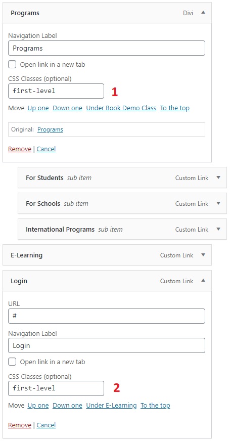
Step 1: Let us set up custom classes for the menu under Appearance > Menus.
Step 2: Click on “Screen Options” located at the top right corner and select “CSS Classes”

Step 3: Add a custom class name (first-level) to the top-level menu items that contain sub-menu items. On my client website, the first-level menu items are Programs, Login, and About Us.
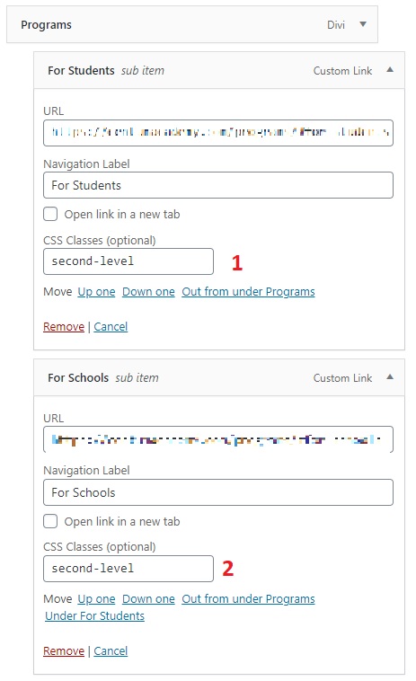
Step 4: Add custom classes to each of the sub-menu items. For example, the ‘Program’ first level menu contains sub-menu items such as ‘For Students, For Schools and International Programs’. Let’s call this class ‘second-level’.
Step 5: Click on ‘Save menu‘ to save the changes
Step 6: Copy the below CSS code and add it to the ‘Custom CSS‘ in ‘Theme Options‘.
.et_mobile_menu .first-level > a {
background-color: transparent;
position: relative;
}
.et_mobile_menu .first-level > a:after {
font-family: 'ETmodules';
content: '\4c';
font-weight: normal;
position: absolute;
font-size: 16px;
top: 13px;
right: 10px;
}
.et_mobile_menu .first-level > .icon-switch:after{
content: '\4d';
}
.second-level {
display: none;
}
.reveal-items {
display: block;
}
.et_mobile_menu {
margin-top: 20px;
margin-left: -65%;
}
Step 7: Copy the below custom JavaScript code and add it to the ‘Code Integration’ section under 'Theme Options > Integration'
<script>
(function($) {
function setup_collapsible_submenus() {
var FirstLevel = $('.et_mobile_menu .first-level > a');
FirstLevel.off('click').click(function() {
$(this).attr('href', '#');
$(this).parent().children().children().toggleClass('reveal-items');
$(this).toggleClass('icon-switch');
});
}
$(window).load(function() {
setTimeout(function() {
setup_collapsible_submenus();
}, 700);
});
})(jQuery);
</script>
Step 8: Save the changes and reload the webpage to see the collapsible menus on the mobile devices as shown below:

That’s it! Thanks to this article.
