
We have seen CSS3’s power in our previous articles using transitions, animations and transforms. Thanks to CSS3, with which we can create effects and animations without using heavy javascript. In this tutorial, we’ll see how to create an infinite looping using CSS3, without trigger. You can implement this technique to create an image slider, a gif or intro of your website.
Note: Older browsers do not support CSS transitions and keyframe animations. Certain browsers require vendor specific prefix to be added.
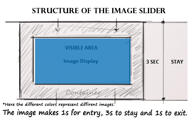
Basic structure of animation
The Animation is very simple: We will have 5 images and they follow a predefined path. All the images would be overlapped one above the other. As the time passes, the first image makes a way to second using the opacity and z-index property. Similarly the other images too.
Let’s see how the HTML markup would look like.
HTML Markup
Lets keep the HTML markup very simple. It’s organized and SEO-friendly. Let’s see the code and then figure out in detail.
<div class="css3ad-container">
       <div class="css3ad-fifth"></div>
       <div class="css3ad-fourth"></div>
       <div class="css3ad-third"></div>
       <div class="css3ad-second"></div>
       <div class="css3ad-first"></div>
</div>
CSS3ad-container is the main container of the slider, which holds the images. Here we are going to place the image div’s in reverse order.
CSS Styling of the image container
.css3ad-container {
    overflow: hidden;
    width:336px;
    height: 280px;
}
.css3ad-first, .css3ad-second, .css3ad-third, .css3ad-fourth, .css3ad-fifth {
     width:336px;
     height:280px;
     position: absolute;
     overflow: hidden;
     top:0px;
     cursor:pointer;
     -webkit-transition: all 0s linear;
     transition: all 0s linear;
}
With the above css code, we have created our slider and 5 image holders. Since each image holder holds different image, we shall code it differently along with the animation. Now we just need to add the animation using keyframes and the corresponding images in the background.
CSS3 Keyframes Animation and the images
In order to get the right kind of animation, we need to arrive at few parameters based on the calculation. Lets see what those calculations are:
Lets fix the total duration of an animation to be 25 seconds. Now we shall calculate, how many keyframes take 1 second. So, let’s work out the calculations:
1. No. of images in the slider: 5
2. The total duration of the animation : 25
3. Animation length of each image Should be : 25 / 5 = 5 seconds
4. To calculate the no. of keyframes equals one second:
Divide the total number of keyframes by the total duration of the animation.
Total Keyframes = 100 (0 to 100%)
100 keyframes/25 seconds = 4 keyframes
4 keyframes = 1 second.
We shall apply CSS animation to the slider. We will be able to put the animation on infinite loop because each image will follow its own animation that activates once it comes front in the slider.
.css3ad-first {
    background:url("1.jpg") no-repeat;
    animation: cycle 25s linear infinite;
    -webkit-animation: cycle 25s linear infinite;
}
.css3ad-second {
    background:url("2.jpg") no-repeat;
    animation: cycletwo 25s linear infinite;
    -webkit-animation: cycletwo 25s linear infinite;
}
.css3ad-third {
    background:url("3.jpg") no-repeat;
    animation: cyclethree 25s linear infinite;
    -webkit-animation: cyclethree 25s linear infinite;
}
.css3ad-fourth {
    background:url("4.jpg") no-repeat;
    animation: cyclefour 25s linear infinite;
    -webkit-animation: cyclefour 25s linear infinite;
}
.css3ad-fifth {
    background:url("5.jpg") no-repeat;
    animation: cyclefive 25s linear infinite;
   -webkit-animation: cyclefive 25s linear infinite;
}
Once the properties of the animation have been assigned, we need to use keyframes to set the animation in motion.
The keyframes can be better explained with the below timing diagram.
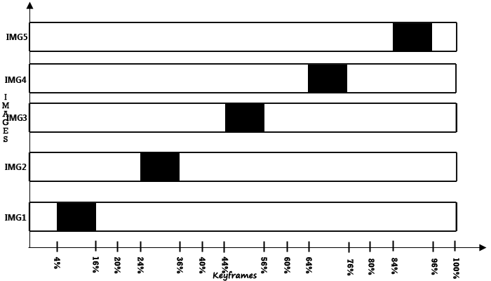
Consider the above timing diagram: Each image takes 1s to enter, stays for 3s and 1s to exit in total 5s.
On load, the first image will be shown till 16%, ie., 4secs
4keyframes = 1sec, so 16 keyframes = 16/4 = 4secs.
Next the first image goes to background with the transition of opacity and z-index in 1sec, making way to the second image. Second image starts entering at 20th frame and stays till 36th frame (3sec). From 40 to 44th keyframes, it starts fading to pave way for the third image. This goes in an infinite loop until with 5th image fading to pave way for the 1st image again!
Following the timing-diagram, we can connect the animations to each other making an infinite loop. For smoother transitions, opacity and z-index properties are been used while switching from one image to the next image.
Below is the css3 keyframe code with the above principle.
@-webkit-keyframes cycle {
     0% { top: 0px; }
     4% { top: 0px; }
     16% { top: 0px; opacity:1; z-index:0; }
     21% { top: 0px; opacity: 0; z-index: -1; }
     92% { top: 0px; opacity: 0; z-index: 0; }
     96% { top: 0px; opacity: 0; }
     100%{ top: 0px; opacity: 1; }
}
@-webkit-keyframes cycletwo {
     0% { top: 0px; opacity: 0; }
     16% { top: 0px; opacity: 0; }
     20% { top: 0px; opacity: 1; }
     24% { top: 0px; opacity: 1; }
     36% { top: 0px; opacity: 1; z-index: 0; }
     41% { top: 0px; opacity: 0; z-index: -1; }
     100%{ top: 0px; opacity: 0; z-index: -1; }
}
@-webkit-keyframes cyclethree {
     0% { top: 0px; opacity: 0; }
     36% { top: 0px; opacity: 0; }
     40% { top: 0px; opacity: 1; }
     44% { top: 0px; opacity: 1; }
     56% { top: 0px; opacity: 1; }
     61% { top: 0px; opacity: 0; z-index: -1; }
     100%{ top: 0px; opacity: 0; z-index: -1; }
}

@-webkit-keyframes cyclefour {
     0% { top: 0px; opacity: 0; }
     56% { top: 0px; opacity: 0; }
     60% { top: 0px; opacity: 1; }
     64% { top: 0px; opacity: 1; }
     76% { top: 0px; opacity: 1; z-index: 0; }
     81% { top: 0px; z-index: -1; }
     100%{ top: 0px; z-index: -1; }
}
@-webkit-keyframes cyclefive {
     0% { top: 0px; opacity: 0; }
     76% { top: 0px; opacity: 0; }
     80% { top: 0px; opacity: 1; }
     84% { top: 0px; opacity: 1; }
     96% { top: 0px; opacity: 1; z-index: 0; }
}
Demo
Finally, we’ve reached the end of the tutorial. The Infinite loop image slider is now ready!
Check out the demo. It works in Firefox 5+, Safari 4+ and Google Chrome. You can also download the ZIP file.