
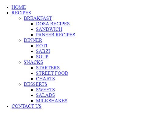
Here’s a quick tutorial that explains how to create a multilevel dropdown menu with CSS. The HTML aspect of the multilevel menu is just lists within lists. But the CSS is what makes it look so attractive and user-friendly. This is how the webpage looks with pure HTML.
By using CSS, we can add a navigation bar for the main list and vertical dropdown lists for sublists. The main lists respond to hover and open up the sublist embedded into it. All of this function is introduced by the addition of CSS.

HTML code for the multilevel dropdown menu
<!DOCTYPE html>
<html lang="en" dir="ltr">
<head>
<meta charset="utf-8">
<meta name="author" content="techglimpses">
<meta name="viewport" content="width=device-width,initial-scale=1">
<title>MULTILEVEL DROPDOWN</title>
<link rel="stylesheet" href="style.css">
</head>
<body>
<div class="menu-bar">
<ul>
<li><a href="#">HOME</a></li>
<li><a href="#">RECIPES</a>
<div class="sub-menu-1">
<ul>
<li class="hover-me"><a href="#">BREAKFAST</a>
<div class="sub-menu-2">
<ul>
<li><a href="#">DOSA RECIPES</a></li>
<li><a href="#">SANDWICH</a></li>
<li><a href="#">PANEER RECIPES</a></li>
</ul>
</div>
</li>
<li class="hover-me"><a href="#">DINNER</a>
<div class="sub-menu-2">
<ul>
<li><a href="#">ROTI</a></li>
<li><a href="#">SABZI</a></li>
<li><a href="#">SOUP</a></li>
</ul>
</div>
</li>
<li class="hover-me"><a href="#">SNACKS</a>
<div class="sub-menu-2">
<ul>
<li><a href="#">STARTERS</a></li>
<li><a href="#">STREET FOOD</a></li>
<li><a href="#">CHAATS</a></li>
</ul>
</div>
</li>
<li class="hover-me"><a href="#">DESSERTS</a>
<div class="sub-menu-2">
<ul>
<li><a href="#">SWEETS</a></li>
<li><a href="#">SALADS</a></li>
<li><a href="#">MILKSHAKES</a></li>
</ul>
</div>
</li>
</ul>
</div>
</li>
<li><a href="#">CONTACT US</a></li>
</ul>
</div>
</body>
</html>
CSS code to style the menu
*
{
padding: 0;
margin: 0;
box-sizing: border-box;
}
body
{
background-image:url("background.jpg");
background-repeat: no-repeat;
font-family: sans-serif;
background-size: 100%;
}
.menu-bar /*vertically displayed*/
{
background:#990000;
text-align: center;
}
.menu-bar ul /*horizontally displayed as a navigation bar in the same line*/
{
display: inline-flex;
list-style: none;
color: #fff;
}
.menu-bar ul li
{
width:150px;
margin:10px;
padding:15px;
}
.menu-bar ul li a /*the anchor tag's hyperlinks are displayed as normal text in white colour*/
{
text-decoration: none;
color: #fff;
}
.menu-bar ul li:hover /*changes background colour of each block when that particular option of menu-bar is hovered upon*/
{
background-color: #cc0000;
border-radius: 2px;
}
.sub-menu-1 /*sub-menu-1 is hidden until the cursor is placed on the menu-bar option containing it*/
{
display: none;
}
.menu-bar ul li:hover .sub-menu-1 /*displays the sub-menu-1 when the menu-bar option containing a sublist is hovered upon*/
{
display: block;
position: absolute;
background: #990000;
margin-top: 15px;
margin-left: -35px;
}
.menu-bar ul li:hover .sub-menu-1 ul /*the options of the sub-menu-1 are displayed in vertical blocks*/
{
display: block;
margin: 10px;
}
.menu-bar ul li:hover .sub-menu-1 ul li/*options of the sub-menu-1 are separated with dotted lines*/
{
width: 150px;
padding: 10px;
border-bottom: 2px dotted #fff;
background: transparent;
border-radius: 0px;
text-align: left;
}
.menu-bar ul li:hover .sub-menu-1 ul li:last-child /*dotted line is removed for the last option*/
{
border-bottom: none;
}
.menu-bar ul li:hover .sub-menu-1 ul li a:hover /*displays the sub-menu-2 when the sub-menu-1 option containing a sublist is hovered upon*/
{
color: #222;
}
.sub-menu-2 /*sub-menu-2 is hidden until the cursor is placed on the sub-menu-1 option containing it*/
{
display: none;
border-radius: 2px;
}
.hover-me:hover .sub-menu-2 /*the options of the sub-menu-2 are displayed in vertical blocks*/
{
position: absolute;
display: block;
margin-top: 12px;
margin-left: 20px;
background: #cc0000;
}
Bonus! Learn how to create Interdependent dropdown menus using JavaScript.