While working with Divi FullWidth Slider module in one of my client’s website, the slider image (put as background image) were getting cut off when viewed in devices with varied resolution! Tried a lot of options by adjusting height, changing background image position etc., but nothing worked. In this tutorial, I’ll explain how to make Divi full width slider image to adjust in all devices with different resolutions.
Adjust Divi full width slider image to prevent cut-off in different devices
The Divi builder utilizes 3 categories of aspect ratio (the height and width of your image). They are:
- 16:9
- 4:3
- 3:4
Note: The most popular out of these are 16:9 and 4:3. Using the aspect ratio calculator, you can find the right image dimensions for your needs.
The Divi full width slider module doesn’t automatically set image height perfectly. It sets the image to full width, but the height varies leaving the image cropped on smaller screen resolutions such mobile and tablets. For most computer screens of today’s world, 1920px width works just fine. Here are few image sizes for 16:9 aspect ratio.
- 1920×1080
- 2560×1440
- 3840×2160
If your designer has provided an image dimensions other than the above and you need to use in the full width slider image, well then you need to know the percentage of height to width, so that the image renders the height across all devices.
For example, my client provided me an image of 1920×600 to be used as slider image. The minimum height for this image can be calculated as shown below:
600 / 1920 = 0.3125 * 100 = 31.25
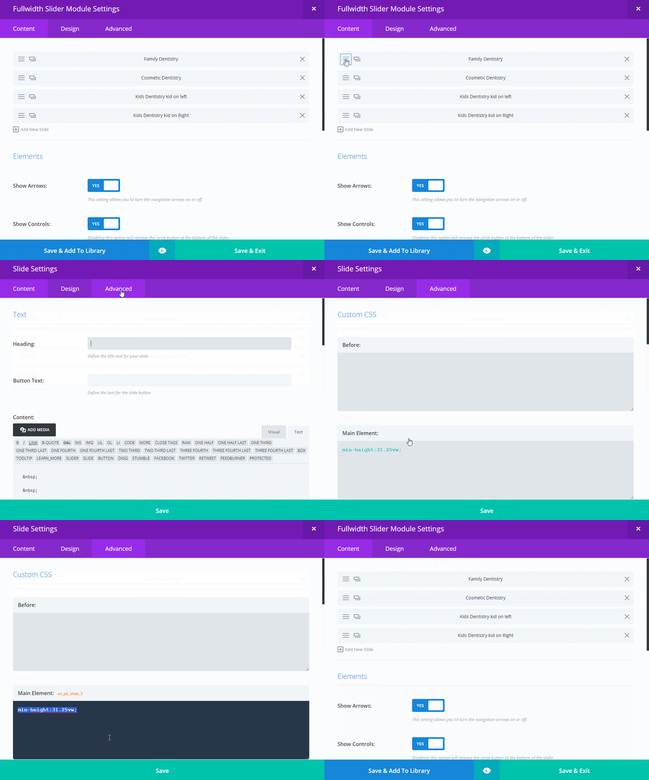
Set min-height of the slider image for 1920×600 resolution, so that it forces the image to display in the height with the correct ratio.
min-height: 31.25vw;
And then, unset the width set to the slider by adding the below code in Divi Theme Option's under custom CSS.
.et_pb_slider .et_pb_container {
     width:unset;
}
This will make your slider image to fit exactly in all devices. If you have any better solution keep posted me in the comment section below.


