Perhaps the most sought-after UI feature of 2019, the most bragged non-functional “feature” in all devices both handheld and not, is the Dark mode. It is a supplemental feature that just swaps out most of your light UI elements with dark ones, giving you a “black theme”. This reduces the light emission of your screen while still maintaining readability, by keeping the user content intact and turning the text white. The dark theme has always been a favourite of programmers as it enabled them to work for longer hours without a lot of eye strain while also improving the visual appeal of the application.
Ever since Google and Apple started the run for darkening their display elements with the inclusion of a system-wide dark theme in iOS 13 and Android 10, which also enables (in certain scenario forces the default settings to change) Dark theme for installed apps that support the same. This has made the dark theme a favourite choice of including for the developers as well.
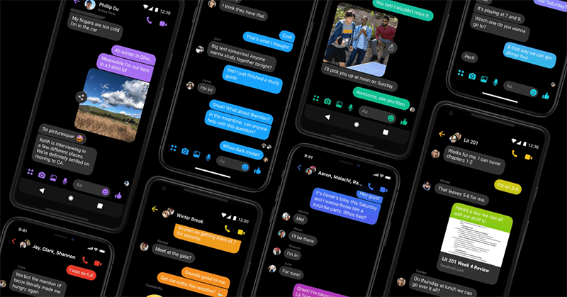
There are many apps which have built-in dark mode irrespective of the OS and the current settings, but some apps in recent times have implementations that use the current state of the system-wide color theme to dynamically theme themselves. However, dynamically shifting to a dark theme is supported only in Android 10 and iOS 13. Certain apps like Facebook Messenger work around this by just providing a dark mode toggle.
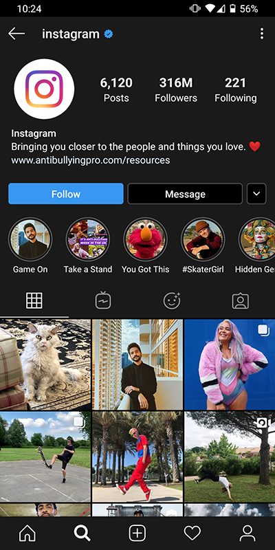
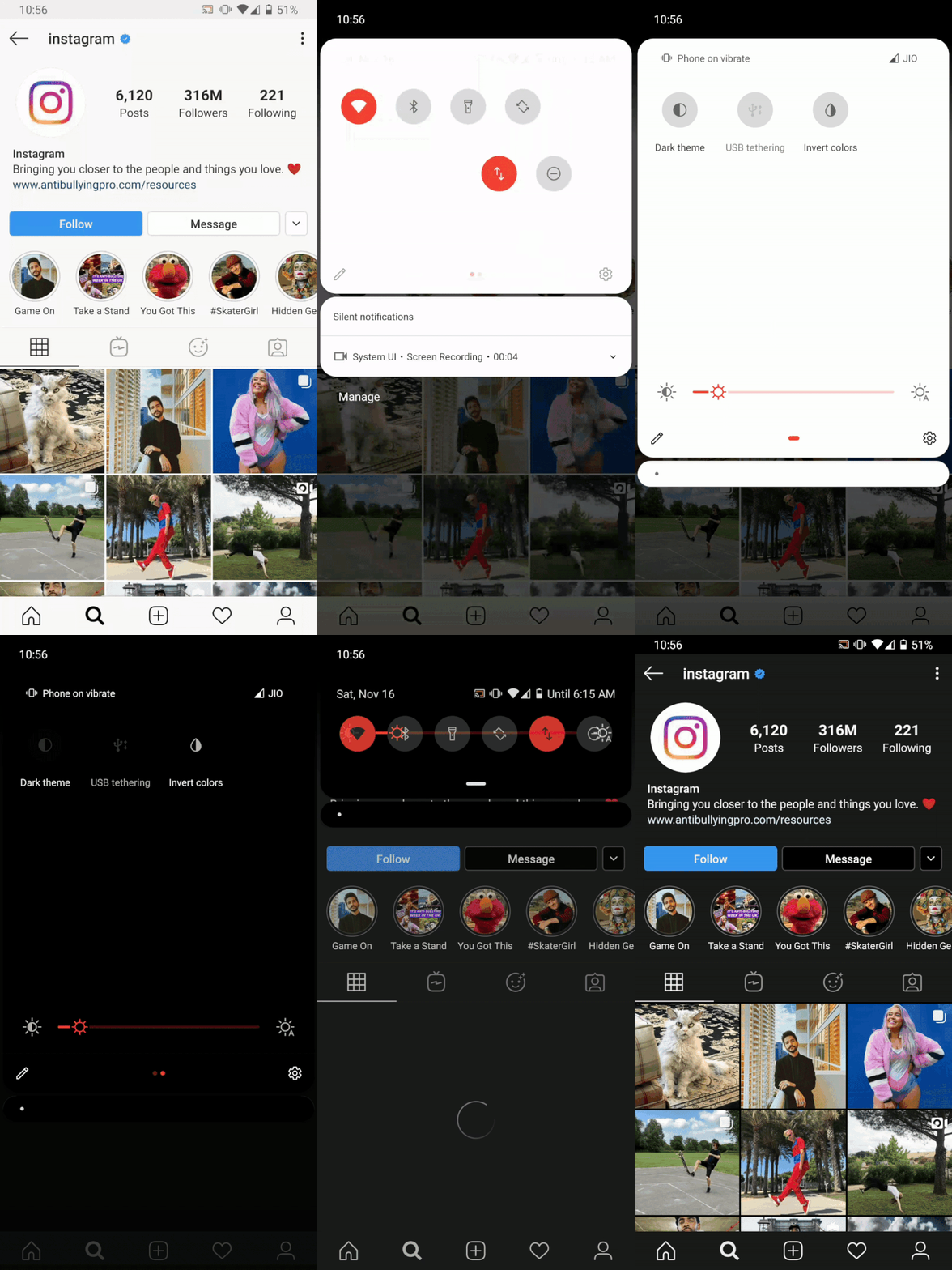
The first app to introduce dark theme was twitter and now, after Android 10, Google has rolled out the feature in their apps like YouTube, Gmail, Keep notes, even Dialer, Contacts, Messaging, and Google Maps. Instagram also followed suit last month by introducing an overall dark theme for their application.
So why is the dark theme so great?
- We don’t want a mobile experience that blinds us like the sun every time we check our phones in bed.
- The Blue light emitted by our phones can disrupt our ability/likeliness of falling asleep. Tinting the screen amber was one of the solutions that dark mode improvises on vastly.
- By taking away a huge fraction of the white light emission, the dark theme can reduce eyestrain increasing productivity and bettering the experience.
- High contrast themes with pure black backgrounds and properly spaced text are easier to read and use for longer periods of time.
- As a changeover for the decade long white theme, black does look classier and is already a favorite of users.
- Phones using OLED or AMOLED screens benefit from the included black theme as they save considerably good amounts of power while displaying an interface that is majorly black (turned off pixels) making your device last longer before you need to juice it up again. Although for this to work, the UI elements should be true black and not a very dark shade of grey.
- for example, youtube on dark mode uses approximately 43% lesser power than the light mode in full brightness.
We’ll tell you how to enable a dark theme on some of the most commonly used apps!
● Instagram
○ The app doesn’t have a built-in dark theme toggle yet. However, users with Android 10, iOS 13, or custom skins like Vivo’s color-OS, OnePlus’ Oxygen OS, Xiaomi’s miui, that provide a dark mode (also often called night mode) can still turn the UI dark by enabling the system-wide dark theme.
● Facebook messenger
○ The app has an inbuilt dark theme toggle.
○ Users with any os enable dark theme.
○ Click on your profile pic icon on the top left and toggle the dark mode button.
● Youtube
○ The app has an inbuilt dark theme.
○ How to enable: Tap on the Profile pic icon on top right > Settings > General > Appearance > Dark theme
● Google Drive, Keep notes, Contacts, Calendar, Calculator, News: Google apps on Android have a dark mode you can activate by opening the hamburger () menu in the top-left corner and tapping Settings. Toggle the dark theme switch to on. These also respond to the system-wide theming
● WhatsApp web
While everyone is eagerly waiting for WhatsApp to join the dark theme wagon, WhatsApp still hasn’t made the feature available even to the public beta. Although the features are in testing and proof of that can be found in the beta APK teardowns, the feature isn’t functional yet. Reports and leaks confirm that the feature is coming out soon and will rollout to iOS first!
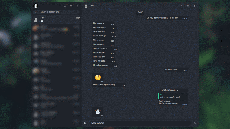
While that stays elusive enough, users are curious about the same for WhatsApp web. Will WhatsApp add the dark theme to the computer counterparts, no clue as of now. But that doesn’t mean developers haven’t found a way to get it already!
Stylus is an extension available for both Chrome Browser and Mozilla Firefox.
Once installed, it allows the user to locally theme the websites they visit using the themes they can search for and install. We have found one of the best dark themes available for WhatsApp web. You can also visit the same website and browse for other themes for WhatsApp web as well as other sites. Once installed, open WhatsApp web or reload the page to see the changes and finally use the Dark theme!
Note: Given stylus is a third party theming extension, there’s always a chance of incompatibilities existing. Keep your browser and the extension up to date to ensure you have the latest bug fixes available.
For years, Android, as well as Apple users, have been waiting for dark themes in both the system as well as app interfaces. The recent increase in the number of apps that offer Dark Mode clearly shows the growing popularity of the feature. Said that, go ahead and enable Dark mode on WhatsApp Mobile


