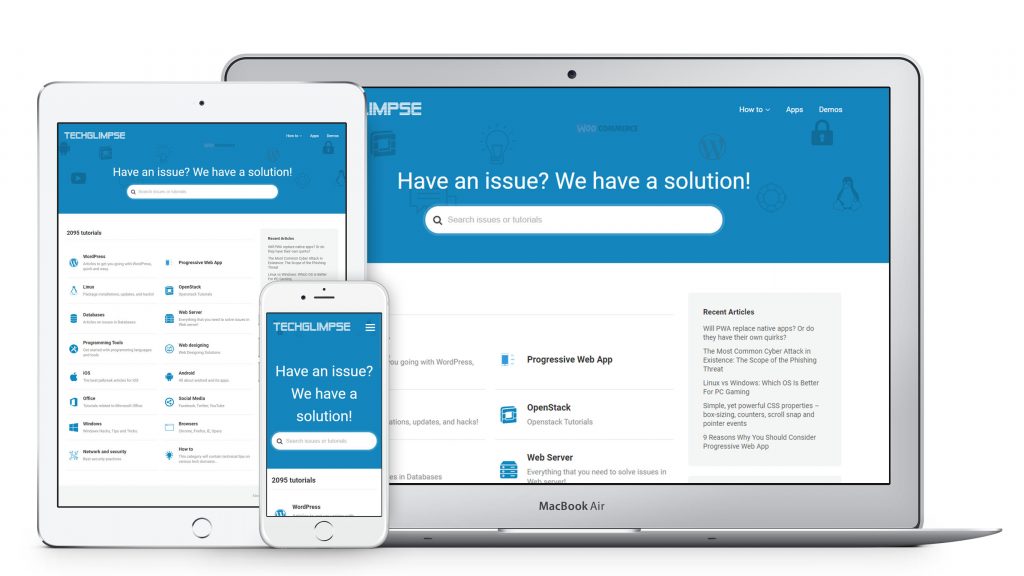
Besides having to mandatorily serve your site over HTTPS, here are some of the necessary changes Google suggests as PWA checklist to be made in your HTML file for your website to qualify as a Progressive Web App.
Make the Web page responsive
Use meta viewport tag to automatically resize, hide, shrink or enlarge the page, thus making it look good on all devices like desktops, tablets and smartphones.
<meta name="viewport" content="width=device-width, initial-scale=1.0" />
Add a Description for your Webpage
Use the meta description tag to add a snippet of fewer than 155 characters to summarize the content of your page. Search engines show your website when the phrase that is searched for, is within the meta description of your page, therefore improving SEO.
<meta name="description" content="Free tutorials on Progressive Web App development along with its advantages and disadvantages">
You can also define keywords for search engines:
<meta name="keywords" content="PWA, SEO , tutorials"/>
One of the best meta description example:
Why it works: In just 22 words, Tesla’s description conveys what the company represents, what it produces, it’s brand values and ambitions.
Specify the language of your website
Use a language attribute on the HTML tag as shown below with the corresponding language code to declare the primary language of the text in the pages from your website. This is the language the majority of your content is written in.
<html lang="en">
Add a Theme Color
This color is used to customize the display of the page, the browsers usually use this color for the title bar. Use meta theme-color tag to do the same.
<meta name="theme-color" content="#9849FF" />
Add alt attribute for the Images
Adding alternative (alt) text to Images provide better image context/descriptions to search engine crawlers, helping them to index an image properly.
Example for Image alt text:
<img src="woman-walking-in-rain.jpg" alt="Woman holding a red umbrella & walking in the rain">
Make Images responsive
Responsive Web Designing is now popular and today, most of the people are using smaller devices, such as smartphones or tablets to browse the internet. Our responsive design should render the images in all the devices properly without losing the image content.
<img src="smiley.jpg" alt="keep smiling!" style="max-width: 100%; height: auto;">


We can use different size images for different devices depending on the width:
<picture>
  <source srcset="smallflower.jpg" media="(max-width: 600px)">
  <source srcset="bigflower.jpg" media="(max-width: 1500px)">
  <source srcset="flowers.jpg">
  <img src="smallflower.jpg" alt="Flowers">
</picture>


